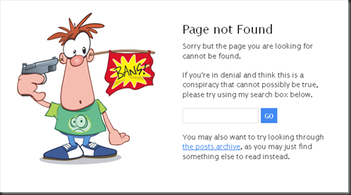
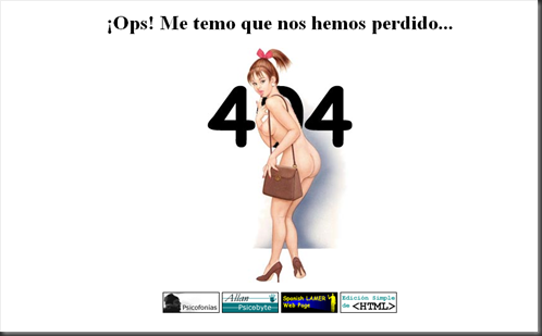
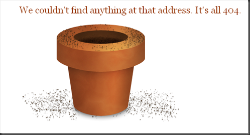
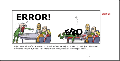
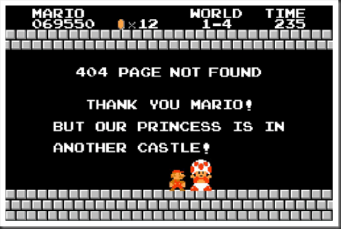
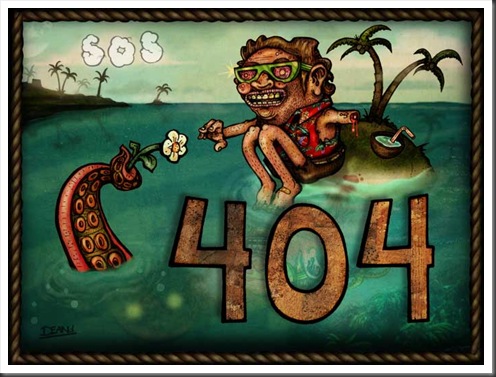
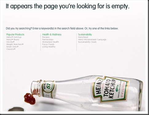
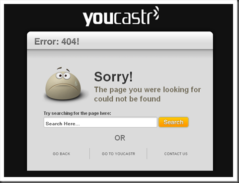
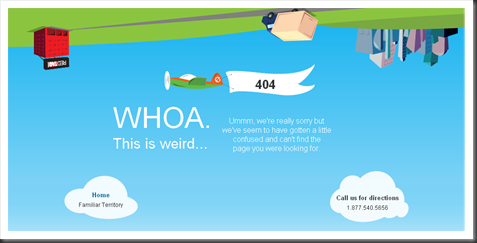
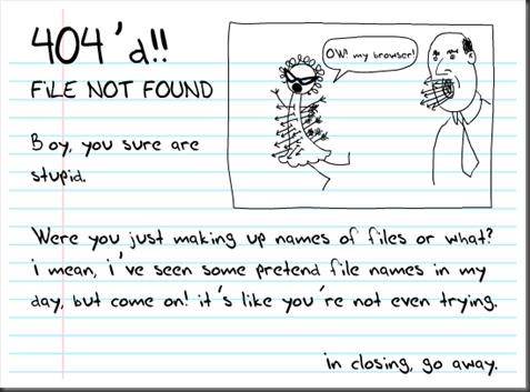
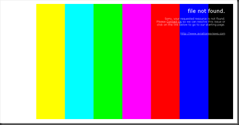
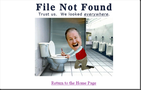
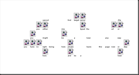
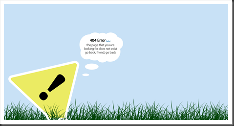
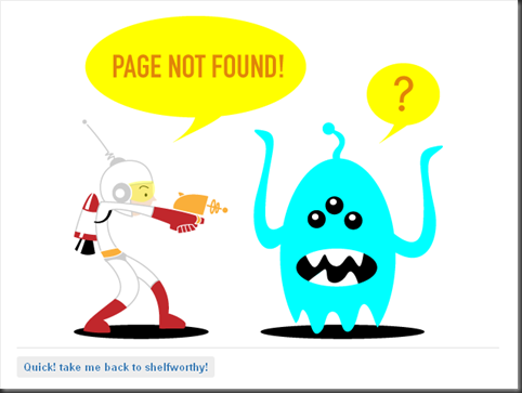
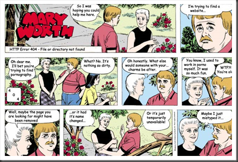
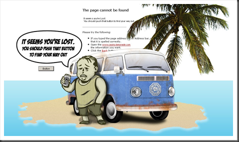
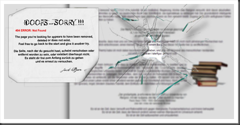
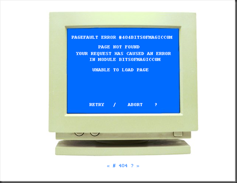
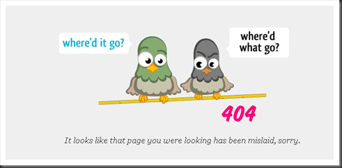
Most webmasters don’t give much importance to 404 error page. But we advised all the webmasters that they must have a 404 error page for their websites. Whenever visitor of a website click on a link that doesn’t exist or broken, he gets to see a 404 error page. It’s frustrating for a visitor when he landed on an error page. Its frustrates him. But if you have a cool and creative 404 error page designed for your website then it gives a second chance to re-engage a visitor. In this article we collected 30 cool and creative 404 error pages to inspire you.
I hope these examples of 404 error page design will inspire you to create a cool and stylish 404 error page for your website. Please do share your thoughts and comments in the comments section.












Pingback: uberVU - social comments
Pingback: 30 Cool And Creative 404 Error Pages For Inspiration | loveishs.com
Pingback: Tweets that mention 30 Cool And Creative 404 Error Pages For Inspiration -- Topsy.com
I really think this one needs to be mentioned. It’s different and offers the user some entertainment:
http://www.proofcreative.com.au/error
Just to update, please use this URL instead:
http://www.proofcreative.com.au/404brokenscreen.html