According to research from ComScore, smartphones have a 64.2% penetration in the U.S. The same study found the most popular mobile apps relate to social, multimedia content, and maps. With smartphone usage on the rise and more businesses wanting to connect with their target audiences through mobile devices, it’s imperative that app designers stay current on the latest trends. Check out this list of seven design tips for developers of mobile apps.
7. Embrace the Importance of Aesthetics
Image via Flickr by LGEPR
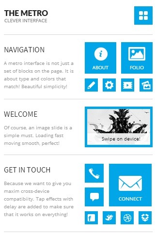
Remember the old saying, “Don’t judge a book by its cover?” In the highly visual world of smartphones, many people make snap judgments about apps based on their aesthetic appeal or lack of visually engaging content. Because of the small screen size, it’s important to be wise in your choice of color scheme, points of contrast, typography, and use of images.
6. Don’t Sacrifice Navigation for Beauty
While mobile users expect apps to be pleasing to the eyes, they don’t want the visuals to interfere with their ability to navigate their way through the app. In fact, experienced app designers say functionality trumps visual appeal because if users can’t interact with the app, it’s completely worthless to them. Ideally, app designers should integrate the navigation elements into the aesthetic design, creating a marriage between form and function.
5. Account for Different Screen Sizes

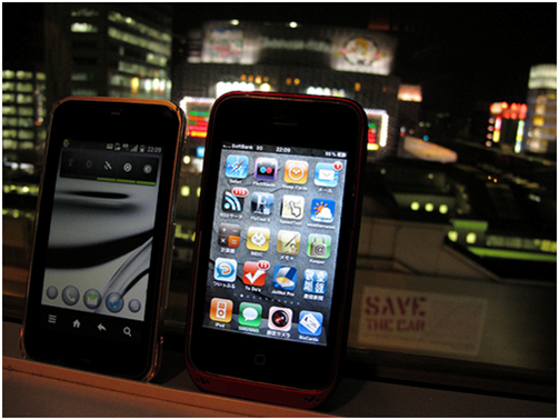
Image via Flickr by MIKI Yoshihito (.w.)
Smartphone screens and resolution vary widely, creating a challenge for app designers. Your goal is to make all elements of your app scalable so that you achieve density independence. Visual elements in your app should not appear larger or smaller, depending on the screen’s density.
One strategy for helping devices scale your app is to include use density-independent pixels throughout the design. You can also use other tools such as configuration qualifiers, alternative layouts, and alternative drawables to address concerns about consistency of the app’s appearance across different screen sizes.
4. Capitalize on Device Hardware

Image via Flickr by Roberto Trm
If your app has any potential for interacting with the phone’s camera, video or audio recording functions, retina display, or telephony, make those connections seamless. With capabilities of the HTC One, for example, apps should key into the UltraPixel camera so users can take photos and then share, pin, edit, or post them instantly and without any additional steps.
3. Have Responsive Data for a Better User Experience
Many businesses have apps that rely on the exchange of data between their servers and mobile devices. A prime example is a retail app that lets users check the status of their orders or track shipping. Ensure your app stores local copies of data so that users don’t recognize that there’s a lull while synchronization occurs. Through coding, you can create placeholders that maintain the user interface while the app is sending and receiving data to servers.
2. Draw on Established Conventions to Create the User Interface

Image via Flickr by Highways Agency
App designers need to be familiar with the guidelines for user interface that are set out by smartphone manufacturers. Integrating swipes, taps, and other navigation gestures into your design helps users jump quickly into using your app. Your app’s layout should also take into consideration the conventions of the platform. While you may come up with some innovative approaches, it’s important to consider how steep of a learning curve there will be for end users, and whether that will drive people away from using your app.
1. Design With the Location of the User in Mind

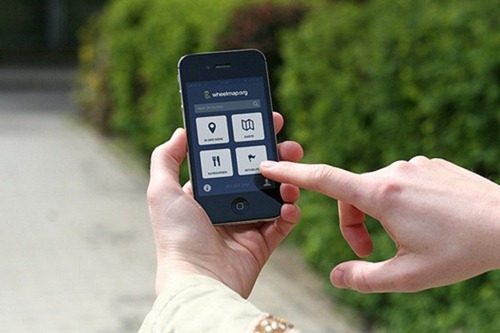
Image via Flickr by SOCIALHELDEN e.V.
Is your app designed to harness the power of the camera to turn the phone into a flashlight? Then make sure the interface is large and easy to see in the dark. Is your app related to geography? Design the app so that someone who’s riding in a car or walking down the street can easily and quickly find the buttons and menus.
As more people rely on mobile phone apps to interact with businesses, app designers must have a firm grasp on which aspects of the apps matter the most to users. If you’re not designing to meet the needs of users, you may find you have very few people interested in adopting your app. What are some of the challenges you’ve faced in designing user-friendly apps and how did you tackle those difficulties?


