Designing icons has become a real art form. As more and more computing is done on smaller and smaller devices, icons have become one of the cornerstones of good branding. Products like the iPad and Android smartphones don’t give companies the space to have large, complicated logos, and so creating visually appealing, attention-grabbing icons has become an important part of digital designers’ remits.
The best icons do the following:
1. They keep it visual. Words don’t scale down well, which is why your icon should rely on images, rather than text, to get the concept of the app across. Some well-designed icons use text as a decorative element, but they don’t rely on words to say what the app does.
2. They take the app’s basic function and make it as simple as possible. They often use visual metaphors or the main design element to explain what the app does as concisely as possible. They don’t use heavy lines on the more complicated illustrations, but they keep it as clean as possible.
3. They add tiny details like texture and highlighting. Even if the designer is the only person who will ever notice the details, they put them in. A little bit of texture, 3D effect or shading can make an app stand out without being too fussy or over the top.
4. They keep the icon consistent with the app’s user interface design. This enables the user to more strongly associate the app icon with the app itself.
5. They make sure it stands out from the crowd. One of the best ways to do this is to avoid the use of Apple’s standard gloss. Apple gives designers the option of putting a glossy finish on their designs to make them seem like part of the Apple family of products. The problem is, the effect makes it harder to distinguish one app icon from another, as the gloss obscures part of the design and makes them all a bit homogenous.
For those who need to see to be inspired, below are some examples of beautifully designed icons that demonstrate these five points.
Convert unit calculator
Convert is a unit calculator. It converts temperature, measurements, weight and more, which users can easily see from the icon.

Outside weather app
Outside is a weather forecast app. The actual app uses cartoonish images to illustrate the weather, and the icon sets the stage for their unique style.

Rebate Tracker app
Rebate Tracker helps users keep tabs on their mail-in rebates, hence the money in the envelope. The wood background and shading just make it feel a little more fun to use.

Classics book app
Classics puts classic books at users’ fingertips, and it takes design inspiration from a classic library shelf, filled with beautifully bound hardback books. The level of detail in the icon really makes it stand out, especially considering most people won’t see it.

Scopy photo app
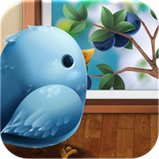
Scopy opens all your images from your Twitter feed and presents them in a clean format. This is illustrated by the Twitter bird, with a few feathers added, looking at a framed picture. Lovely.
Last Stand Stan game app
The Last Stand Stan icon has a pretty complicated illustration, but they make it work by using thin lines, contrasting colours and one main drawing – that of the game’s hero, Stan.

Camera+ photo app
Camera+ turns an iPhone into an almost professional camera. The icon demonstrates this with a camera lens, the plus sign to indicate its extra features and the circle of colour, which is both trendy and eye-catching.

Dunk app
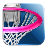
Dunk is a Dribbble feed that constantly streams new, inspiring designs straight to users’ phones. Dribbble has a really strong brand already, so its icon plays on that with the hoop.
Inkpad drawing app
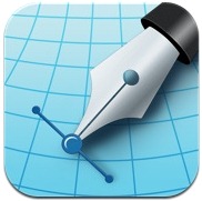
Inkpad is a vector illustration app for the iPad, so it uses symbols that would be recognisable to any designer: graph paper, a pen tool and the vector being drawn.
Concentrate productivity app
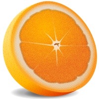
The clever Concentrate icon plays on the two meanings of the word. The app itself forces the user to concentrate on his or her work, while the icon and branding reference concentrated orange juice.
Are there any icons that you’ve found that deserve a mention? Let us know in the comments.


