Before you start to create a mobile website, there are some things you need to consider. First and foremost is that your aim when you create a mobile site is quite a bit different than when you create a desktop site. But with nearly 10% of all World Wide Web users accessing sites via mobile, this is an area that businesses can no longer afford to ignore.
With that in mind, here are 9 items mobile site users demand you pay attention to from the very beginning of the design process:
Keep It Quick
The number one killer of mobile sites? Slow loading. Tests have proven that a load time of more than 2 seconds causes a more than 40% drop rate — hit 3.5 seconds, and you lose 70% of your surfers.
Keep it Simple
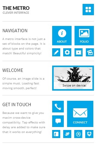
If a user has to zoom in on your screen to figure out where they want to navigate to next, you’re losing surfers again. Crystal-clear navigation and search functionality from the landing page is an absolute must.
Opposable Thumbs Rule
Design your site with thumbs in mind. In other words, imagine holding an iPad or Kindle Fire in your hands like you would a PSP — the spaces your thumbs can reach should be the places where the most important links and buttons are.
Big Font
Your site needs to be easy to read even on the smaller screens of last decade’s smartphones because most of them are still in use. So for best results, stick with big, simple fonts that still look classy.
Avoid Unnecessary Graphics
If your graphic isn’t there for branding and it doesn’t do anything, cut it, plain and simple. Unlike desktop users, mobile users don’t need to be wowed into sticking around and reading. Remember, they didn’t ‘surf’ to your website, they sought it out and found it. Give them what they want most, cut the rest, and run with it.
Universal Access
Your mobile site should look more or less the same no matter what device you try to access it from. Use vector images wherever possible, and where it’s not, create a variety of variations of your on-site pictures using standard photo editing software and responsive design techniques to choose which version is the best to display on any given screen. The best way to test this is to load up your site not just on mobile devices, but on a variety of desktops and laptops as well. If your graphics still look clean on a 17-inch screen, you’re doing it right.
Conversion Is The Goal
If your users don’t have very clear ways to make purchases or otherwise use the tool you’ve given them, your site won’t be profitable. The end goal is conversion, but the tool to get there is usability.
Make It Seamless
Your surfers that are accustomed to seeing your desktop site should immediately recognize the site’s mobile version and be able to find the primary functionalities in roughly the same place on the screen of their mobile device.


