We’re all familiar with cartoons from our childhoods. The colours, familiar characters and the visual trickery of a cartoon are ideal and utilized in web design – it’s familiar, its fun and it’s effective.
Cartoons offer instant gratification for the eye; they are a visual feast and can create an impression or a certain image within seconds of seeing them. This quick way of sending a message and also grabbing user’s attention has the effect of firstly getting people to stay longer on a page, while having the added effect of creating an image or brand that is communicated quickly.
Cartoon style pages allow a huge amount of creativity while still easily adhering to the usual rules of web design. It is as easy or easier to create a cartoon that creates an effective corporate design than it would be with a run of the mill site.
Cartoons can obviously be a little too bright and too much on a site – not something that always works. One of the best ways to sort this out is to tame it with a little bit of matt colour and calming colours such as light blues or pinks or browns. This is ideal for a corporate page.
Linear websites with bright colours, as you may guess, deliver the complete opposite effect. The sharp edges and bright background combine to make an exciting, powerful and fun site. Ensure the site is simple and the character or cartoons straight forward for maximum effect.
A mixture of styles can also be very effective if you find the right balance. Mixing up fonts in a scrapbook style and adding in a number of different pictures and using cool colours gives a sporadic but still balanced effect to a page. Break it up with dark lines and it will add composure and make a fresh web page.
Not everything is clear on first sight with cartoon pages – in a similar fashion to the morals and lessons included in most cartoons. Some sites create beautiful simple designs for landing pages that have a far deeper meaning. Images such as trees representing companies and the fruit they produce being watered by pictures of cartoon customers speaks for itself.
Some sites even go as far as to use cartoons completely and not use text at all in their sites. These sites completely communicate through pictures and this is something a little different if you can get the clarity of purpose on the pages.
Large banners with vibrant colours and cartoons can really add vibrancy to a page and certainly scream ‘look at me.’ These pictures are a great way to get attention and get people interested in your page.
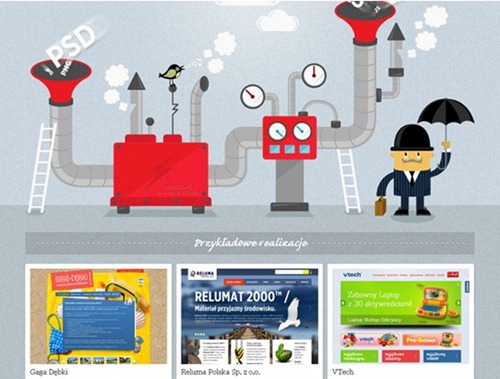
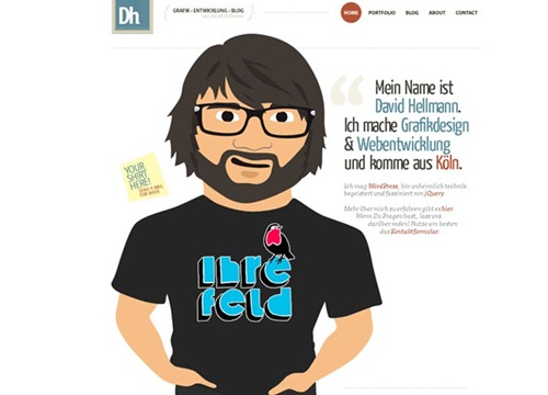
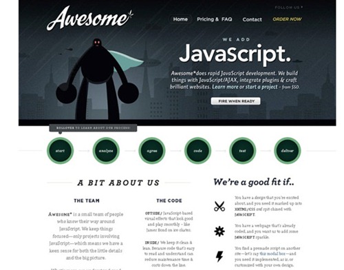
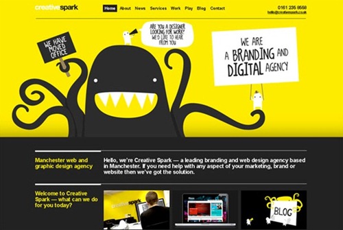
For today’s design inspiration I have handpicked 10 examples of cartoon website designs.
HTML5 Lab
Davidhellmann
Awesome JS
Creative Spark
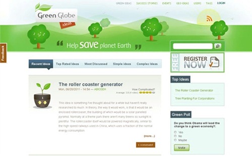
Green Globe Ideas
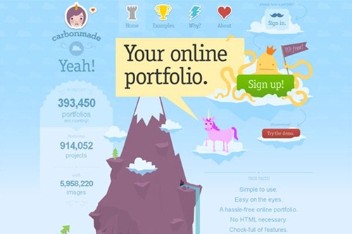
Carbon Made
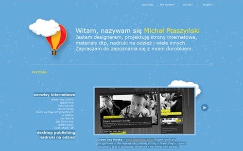
Ptaszynski.biz
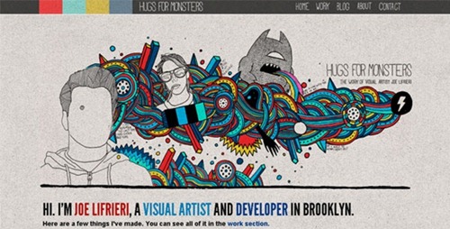
Hugs for Monsters
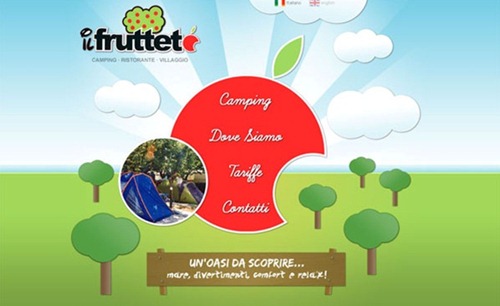
Campingilfrutteto.it

Pingback: A Collection Of Awesome Hand Drawn Website Designs
Beautiful collection!!
Thanks so much for sharing this!
thanks.Beautiful collection.