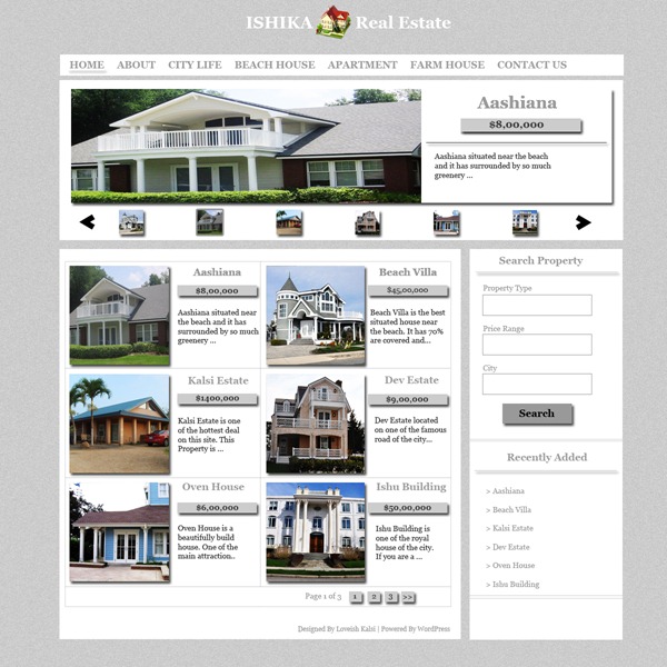
This tutorial is about designing a WordPress Theme in Adobe Photoshop. This theme is for the real estate business company. This theme has a cool design and a cool looking featured post slider at the top. Lets get started with the tutorial.
What We Are Creating
Stock Images for The Tutorial
Create A WordPress Theme For Real Estate In Photoshop
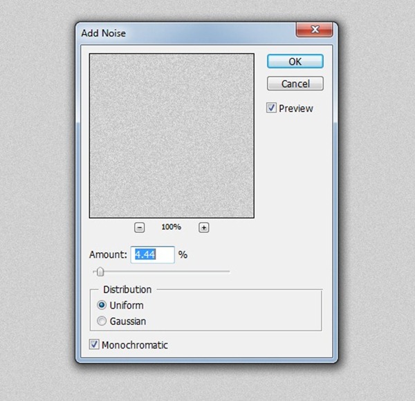
Create a new document of 1200*1200 pixels and fill it with #cccccc. Now add the noise to the background at the amount of 4.44. (Filter > Noise > Add Noise)
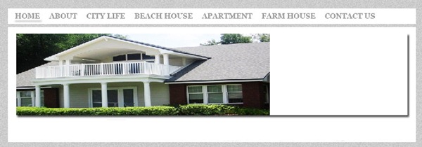
Now its time to create the navigation for the theme. Select the 960 pixels wide and 35 pixels of height rectangle with rectangle marquee tool. Then right click on the selection and fill it with white color and right click it again and click on make a layer via copy. Now your navigation is a new layer.

Select the background color as font color and write all the Category names on the navigation. Now its time to give the opened page design to the home page link by drawing a line at the bottom of the Home link and now select the blending options of the layer and select drop shadow and press ok. Your top navigation is ready.

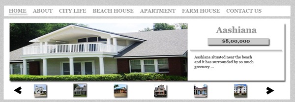
Now its time to draw the featured post area. Select a rectangle just below the navigation with the rectangle marquee tool and repeat the options of filling it with white and make it a new layer just as you done it for the navigation area. Now draw another rectangle inside the rectangle to add the area of featured post image and description. Don’t forget to give the drop shadow effect to this layer by clicking on blending options and then drop shadow. Now add the one house image on the left corner of the layer just like the screenshot below.
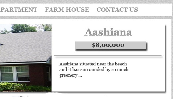
Now its time to add the title and description of the featured post. Write the post title on the right side of the image and then draw a rectangle just below the post title and fill it with the background color and make the new layer of it and give the drop shadow effect to the layer. Now write the price of the property on this box. Write the description below the price tag box.
Now its time for the 6 small icons of featured posts just below the main feature post. I create the icons of 25*25 pixels. I used all the 6 images that I have mentioned in the start of the post. Now give the drop shadow effect to the 5 images by clicking on blending options and then check the drop shadow option.
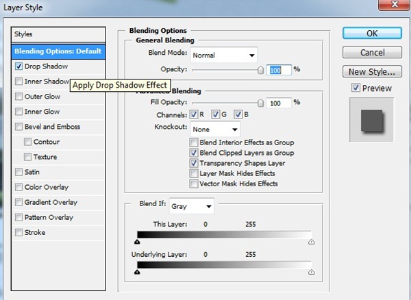
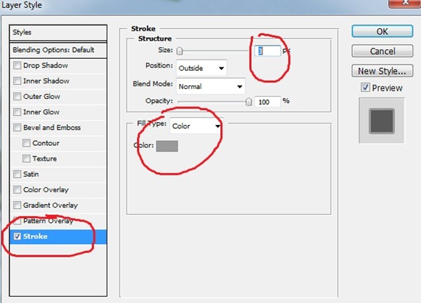
Now its time to give the effect to the 6th image that is the icon of the featured post that is selected. Just click on the blending options of layer and select the option of stroke and select the setting just as shown in the screen shot below.
Now its time to add the navigation arrows at both sides of the slider. Open the icon image and cut the arrow you want and paste it on the one side of the slider and then invert it and place it on the second corner of the slider.
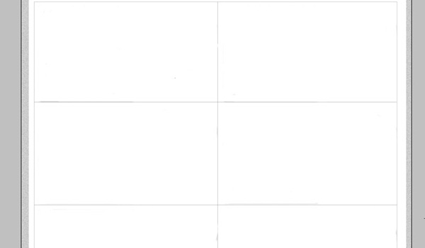
Now we come to the post area. I divided this section into two rows because it looks beautiful according to me. The effects are same as we done in the featured post area. But before starting the effects and design we have to create the basic design. In the post area section create 6 boxes with the line tool or any other tool of your choice( you can do it with various tools such as rectangle selection or line tool). I did it with rectangle tool. See the screenshot below.
After drawing the boxes now its time to design a single post. Then you can repeat the action with other five post boxes. First open a house image and then reduce its size to 180*180 pixels and place it on left side of the box. To create the post title and price tag just repeat the actions of featured post heading and price tag. But keep in mind that the size and font will be small than the featured posts and then repeat the complete process with rest of the five post boxes. Your post area will be ready.
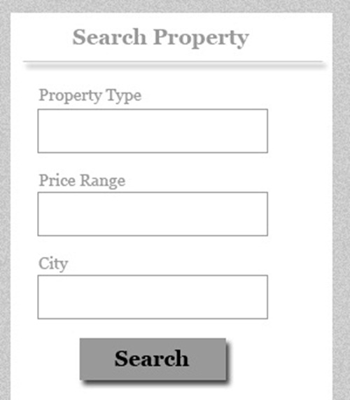
Now its time to add the search column in the sidebar of the blog design. Draw the three boxes with rectangle marquee tool and then right click on the selection and select fill option and fill the boxes with white color. Then write the box names on the top of the boxes. Now time to create the search button at the bottom of the post. Draw a box with rectangle marquee tool fill it with background color and add the drop shadow effect to the box. Your search column is ready.
Now its time to add the navigation below posts. Draw the rectangle buttons for navigation with rectangle marquee tool fill them with background color and add the drop shadow effect. Now write the page numbers on the boxes.

Now its turn to add the finishing touches. But before that add the logo to the top of the theme. I used the house icon from Deviantart for logo design. First write the Ishika or your desired name and then place the icon and then write the real estate. Add drop shadow effect to the house icon.

Your wordpress theme for real estate company is ready. Here is the final result.





Pingback: Top 50 Photoshop Web Layout Tutorials from 2011 | Design Inspiration