We’re in a day and age where no matter your profession, creative or not, having a web presence is absolutely key to promoting yourself and getting business. As a filmmaker, I know the importance of a good web design to showcase my work, gain traffic for my business and the best way to incorporate media players into my website. For all filmmakers, having these elements is very important to strike a balance between nice, aesthetically pleasing website, but plays to the ultimate role of promoting one’s work. These designs don’t need to be intricate, and thanks to platforms like WordPress, everyone can have access to at least a simple web design. But if you’re really wanting to stay above the fray and stand out, keep in mind the following tips.
Layout
This is of course where it all starts. The layout of your site as a filmmaker has one purpose, and that is to show off your work. While using photos as a part of your web design is acceptable, stills aren’t what people are coming to your site for. They want to see your video work, and that is what you site should be built around. You should plan for where you want your media to be, and the area around it should be complementary. Establish a color scheme, possible using colors included in a logo if your have one. Or if you are a filmmaker trying to establish a certain aesthetic through color grading, film genre, etc. use the color scheme to help reinforce it. For example, say you’re a filmmaker focusing on film noir and suspense, using dark colors would help complement your work. Also, if you do have a logo, try to use it when you can to help establish yourself as a brand, much like any business would.
Best Media Hosting Sites
Not all web platforms self host videos, and sometimes it can get expensive to acquire that kind of ability. Luckily, it is not really necessary to self host your media, and you can embed your media from other hosting sites like Youtube, Vimeo, and others. Using Vimeo is recommended for serious filmmakers because of the simplistic video player that highlights your work versus promoting its brand along with your video. Vimeo has taken a lot of steps to create a player that, when viewing a video, basically drops out with only the video in view. This give you the benefit of not having a third parties media player logo distracting from your work, but Vimeo is also regarded as a more professional platform. Youtube still has the connotation of amateurish, viral productions, and unless that is what you’re going for, you should avoid that. Vimeo is also very easy to use to embed on your site as you can use presets to embed, or you can customize them perfectly for the width you want on your site. That kind of control will get your site noticed.
Simplicity
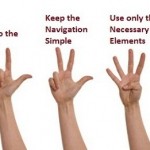
When it comes down to it, you want a site easy to navigate for your users. Having a design with multiple pages, deeper pages linked to from those pages, and so on, is not necessary. You want your work to be found easily, and by keeping it all on one page, or even the home page if it seems fit, that is what you need to do. Don’t bury your work under layers of other pages making it hard to find for your visitors. This will turn off your audience, and most likely make them leave and never revisit. This is of course the absolute worst thing that can happen, so make sure you avoid those mistakes.


