They tell you that eye contact a smile and a strong handshake will help you make a good first impression. And of course, that’s all true. But what happens after that? Well, somewhere after the first hello and before an “It was nice meeting you” there may be an exchange of business cards. That tiny little act is a gesture that says “I’d like to remember this meeting”. But how exactly you’ll be remembered can very well depend on your business card. Those tiny little things say a lot about you and the better they are, the more memorable you will be.
Color
In a world full of colors sometimes the hardest part is narrowing down your choices. Black and white is still a striking combo if used well. Just makes sure it goes a little beyond plain black type on a simple white card. If you want to use color, obviously you should think about branding. If you have a logo, you’ve already made some very distinct color and style choices, so stay true to them. But don’t be afraid to play around with variations on a core theme. Also, think about the psychology of color. As designers you can cater to human emotional and mental predispositions to color connotations. Otherwise, don’t be afraid to be bold and make a statement with color schemes that will be attention grabbing.
Images
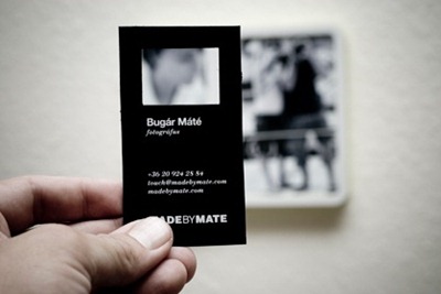
Most of us are very visual people and pictures do speak 1000 words after all. Using your own face is a brave choice and it will keep people from ever forgetting what you look like. Otherwise images can be used to highlight the main theme of your business or to show off your photography and design skills. Just remember, if the image is truly stunning people will be drawn back to it.
Company Info
Conveying a company’s information is your business card’s primary function, so above all make sure it accomplishes that goal. It’s not rocket science, but here are a few things to remember.
Company Name – This seems obvious, but some designs make the company moniker hard to spot. Make sure your brand name is the focal point of the card and then build from there.
Company Info – Your business cards should also make it immediately evident what the company does. You don’t have to get in a ton of details, but if your name is “We Rock Media” it’s not immediately evident what you do. If the name alone isn’t 100% self explanatory, make sure you use some sort of tag line to clarify the main function of the business.
Phone Number – Always include 800 numbers, area codes, direct lines and/or extensions. A main company line is fine, but it’s better to include all of the necessary information for a possible client to reach you directly.
Web Info
The internet is a massive and powerful business channel and so a business card should accommodate that. Be certain to include all of the possible ways someone can be reached or researched online.
Email – If you work for a company, odds are you have a business email, which makes this easy. But entrepreneurs and freelancers need to think about using their most professional sounding account. If you’ve spent all that time building up a personal business and brand, don’t ruin your business card with an email address like ilovebananacake@hotmail.com. Unless you sell banana cake, in which case it’s fine.
Website – If you have a website, list it. Makes sure to put the URL somewhere on the card and if you want to get really fancy, look into getting a QR code that can also go on a business card. If you don’t have a website, well then you should get one. But in the mean time, create and list your social media profiles.
Twitter Username – Speaking of social media, if you have an active Twitter account that you use for business go ahead and add it. If you only use it to Tweet about dinner plans and Glee episodes… don’t bother. If you are thinking of using Twitter in place of a website, also consider a LinkedIn profile which is a bit more professional and great for networking.
Personalization
Your business card should be a little extension of you and so the more personalized it is the better. Again, nothing is more personal than your own image but you can go beyond that. Use the things that you love, the icons that epitomize you as a jumping off point for brainstorming. A little bit of personality in the design and execution of the card can make a huge impact.
Try to think past what is considered “normal” for a business card. Experiment with different shapes, like a round business card. Or play with textures like using fabric instead of paper. If you can afford it, die-cutting is an awesome way to add a little extra visual interest to any business card design. The idea is to come up with something other than the standard, basic business card. Sometimes it’s the little differences that can set you apart from the crowd.
It’s really easy to throw together a simple business card. But there is something of an art to creating one that is truly unique and exciting. It also takes a practical mind to feature all of the company’s most critical details. But if you can display all of the most important business information in a way that is eye-catching and memorable, that is the best formula for designing a truly great business card.


