In order to develop a successful website, designers and developers must first work towards making it intuitive and one of the best ways to making a website intuitive is by giving it a clean user-interface. Let us take a look at some of the ways in which you can give your websites a cleaner interface and make it intuitive for the users.

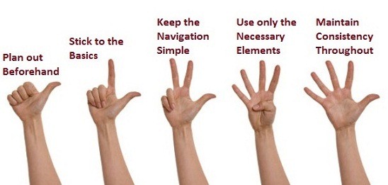
Plan out Beforehand
Do some mind-mapping and plan your website as precisely as you can. Even though you may not be an extraordinary artist, just visualize how your site would look like on the users’ screens and make a rough sketch with proper placement of the design elements. Design and place elements like tabs, buttons or sidebars on the page depending upon the requirements of the site. Refine your design, mix and match the position of the elements till you are fully satisfied with your handiwork. Once you are sure that this is what you want, go ahead and implement the same in your actual design.
Stick to the Basics – in Terms Of Color Scheme
Use simple color schemes on your site. But this does not mean that there is no scope for experimentation; mix and match colors depending upon the type of your website. For instance, if you are designing a site for a fast food joint, use bright and vivacious colors; think something on the lines of bright red or sunshine yellow. However, if you are working on an education portal, it is advisable that you choose neutral colors or pastel shades to match the theme of the site.
Keep the Navigation Simple
Do away with the complex navigation systems on your websites. This is necessary because all users are not tech-savvy. Make it so simple that be it a 7-year old boy or his 70- year old grandmother, both are able to navigate through the site effortlessly. Highlighting the navigational links on the area above the fold on web pages or minimizing the need for vertical or horizontal scrolling are two of the ways in which you can make the navigation of your site easy. This also has an added advantage; even if your users access the site from their mobile devices, they would be able to navigate it as easily as on their laptops or desktops, thereby increasing the success ratio of your sites.
Use only the Necessary Elements
Make sure that the content on each web page is unique and there is no room for duplicity. For instance, there is a call-to-action button on a web page, which takes the users to a page that contains a form. But on the same page, there is already a link, which takes the users to the same form. This is what I mean by duplicity; there are two different elements on the site which meet the same purpose.
Also, remember that users will have limited screen space to view the content of your site. Duplicity of elements will make it difficult for users to locate something they are looking for on the site. Hence, filter out all the redundant elements and replace them with new, essential ones which are unique to that web page.
Maintain Consistency Throughout
Maintain consistency throughout all your web pages. Be it the fonts used, the layout or the style of the design elements, everything must be in perfectly synchronization. For example, if you are adding rounded corners and shadows to your text boxes, do add the same effects to the banners or sidebars which will give the web pages a consistent look and feel. If there is no consistency, then some elements might look out of place and this will hugely distract/upset the end-users.
Follow these afore mentioned tips to get a clean user-interface for your website which will in turn, help you make it intuitive and a success with the end-users.


Great! Would like to add that even content is also an integral part when it comes to ‘User Interface’, the content we are using in the design should be crisp and crux, which proves to be rich in terms of information. Hope you agree!