We have all come across it, years of signing up to sites and buying items on the internet we have all skim read potentially important information, it’s only natural, we want to get to the finish line as fast as we can. But this has resulted in quite big sites taking advantage of our impatience and negligence to detail.
So what are companies doing to take advantage of this?
Dr Harry Brignull, a UX designer in Brighton has put together a list of different Dark Patterns on his site. Here are some of the most evil, disgraceful and a little bit genius aspects of bad web design.
Disguised Ads
Adverts that someone has designed with the requirement to deceive the user into thinking it is other types of content or navigation, in order to gain more users to click through onto them.
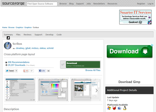
We see it on the popular (and trusted) download websites, such as CNet, Scourgeforge and others where users are misled into clicking the advertisements that are disguised as the download link. Many of them will misdirect you to other sites where a download is offered, but with additional toolbars, addons, anti-virus software and other software.

Hidden Costs
Hidden costs are only shown to the customer on the final step of the checkout process.
One of the most infuriating for many users is that once they have had to set up an account, added to basket preceded to checkout and got ready to pay, additional costs are then disclosed in the form of delivery charges, taxes or in a favourite or many ticket resellers “admin charges”.
Trick Questions
When the user is asked a question which at a glance appears to ask one thing, but when read carefully asks another thing entirely.
Possibly the most controversial of all is when sites use a process of using a combination of negative and positive checkboxes, “tick here to opt out” followed by a “tick here to opt in” is a sneaky way to get users to tick to opt in, especially when there is extra revenue to be made from users unwillingly signing up to 3rd party marketing.
Take this example from Subaru Australia’s checkbox usage that requires the user to tick the first box and leave the second and third uncheck as to not receive any unsolicited marketing emails. It doesn’t help that the wording is made purposely complex.

Sneak into Basket
The user makes a purchase but additional items are placed into the basket that could have been removed via an opt-out radio button or checkbox earlier in the process.
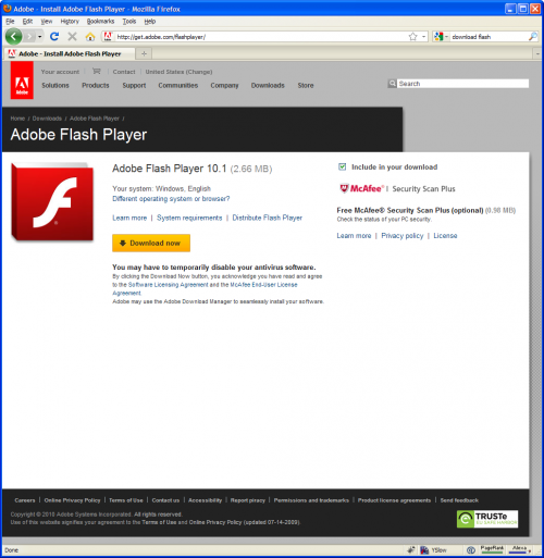
Including additional items as a “recommendation” is treading the fine lines of legality, many sites would see increased revenue from people not removing the additional items. This is common for travel companies that have included holiday insurance as an additional extra and is often included in many software downloads to include additional software by default, as found on the Adobe flash player site as they bundle in McAfee firewall via a pre selected opt in button.

Awareness is the key to combating these evil usability designs and the more people that know about it, the more people are aware of what tricks some companies like to use to increase their own revenues. If you have any more examples of controversial usability and site design, I’d love to hear about them in the comments below otherwise I encourage you to contribute to the darkpatterns.org site as found above.


