eCommerce sites are being used all over the world owing to the high levels of convenience they offer to shoppers. All they need to do is simply click and order any product or service from the comfort of their homes. Thus, developing an eCommerce site can be a profitable venture.
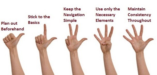
But this is easier said than done; it is difficult designing an eCommerce site that generates maximum profits. However, you can take care of certain aspects before actually designing such sites if you want to make them successful.

Let us take a look at some of them, which are given below.
Design is not everything; make your site functional
Design plays a very important role in eCommerce website; you simply cannot present a shabby website to your end-users. But then, design alone is not sufficient to take your site to great heights; the site needs to provide functionality to the users as well.
Remember the adage “you can bring a horse to the water but you cannot make it drink”? Similarly, you can draw the attention of your customers to your website with an alluring design, but without making it usable, you cannot persuade them to take the desired call-to-action.
If you have a nicely designed site but if it does not give users the required functionality, it can increase the bounce-rate of your site.
Keep things simple and straightforward
Make sure that your end-users do not encounter any problems when they surf your site; for this, you must ensure that your site has a user-friendly interface. If your site offers users what they are looking for in a manner that is easily understood, they are more likely to buy products from the site. More importantly, if the site is easy to use, the likelihood of shoppers completing the entire shopping cycle, increases. This improves website profitability.
Shoppers are less likely to abandon the shopping cart and thus, you will not lose your potential customers, if you focus on simplicity when it comes to the design of your eCommerce website..
Some of the ways that you can bring this about is if you categorize your products in the best manner possible, implement various design elements such as well labeled call-to-action buttons make navigation effortless etc. Thus, your customers will find it easy to go through your site every time.
Aim at a flawless payment process
Payment is the final step and most important step in eCommerce sites. For this, you must make the payment process easy and less lengthy, with as few steps as possible. Otherwise, the users will find the payment option(s) confusing and tricky, they may get annoyed and will not proceed further to confirm their purchase.
One of the biggest mistakes that designers make is that they place various promotional offers and discounts at the wrong places. For instance, they place them right at the end of the shopping cycle in the payment process and confuses the shoppers further. You must make sure that these offers don’t come in their way while they are checking out as it may distract them from finalizing the purchase.
What you can do instead is display the offer on products in the product description itself or highlight it on the product image itself. Thus, shoppers will be informed in advance about the offers and discounts on various products and they will be able to take a quick decision.
Make an appropriate use of images
Since the customers will be making a purchase virtually, they will not have any other option but to rely upon the images, videos and product description/specifications on your site. Therefore, you must use high-resolution and relevant images for your products which will give the shoppers a clear idea about the features of the products they are planning to buy from your site.
Also, don’t go overboard with the number of images; it may confuse the users from taking a decision. What you can do instead, is maintain a proper text-to-image ratio. For example, you have an eCommerce site related to tablets. In this case, you can either upload various images of the tablets from different angles or present a diagrammatic representation of the tablets with each part clearly labeled. This will surely give the customers a clear idea regarding what they are about to buy and they will not hesitate to take a call-to-action.
Thus, prepare a sort of checklist concerning these above aspects before you design your eCommerce sites in order to make it successful.


Good info! Bringing a potential customer to your website and satisfying them with your product, both are the two different things. It is upon the simplicity of your website (simplicity means ease of understanding) that will keep the interest of the visitors anchored from beginning to the end. Catchy one-liners for grabbing attention, short, crisp and pleasant content to image ratio, simple, secure and flawless payment gateway are some of the pre-requisites of a successful e-commerce portal.